I have interestingly learned a lot in this class throughout this semester. Coming into this class I presumed that I would sit in a classroom that looked like the one we had, with big iMac monitors. I also assumed that our instructor would assign us projects and guide us throughout the assignment by teaching us cool tricks and giving us tips, but this turned out to not be true. What actually happened was that the professor assigned us a project and we the students figured out on our own how we went about getting the project done. YouTube and our classmates were our main resource and the professor was there to help us when we couldn’t figure something out on our own. It is interesting how much I really learned with this learning style, and how close I became to my group-mates. This learning style forced me to interact with my classmates, give and receive suggestions and ideas, and better surf the internet to get the answers seeking. Through this class I have realized what University level education is really all about.
Interactive Map Final
Final Details:
Theme: For my final’s theme I decided to keep the postcard idea, except ended up making it much less detailed than initially planned. I though I had much more time to work on this project than I really did. It took me a while to figure out that this project was more about the interactions I could produce with catalyst than it was about design itself.
My goal was to recreate a day at the circus so I decided to keep using my poster project and make the object from the poster clickable, like the tent and the cage. Once you click on the tent or cage it takes you to what would be inside of the circus tent during its working hours, and describes what would normally be carried inside the cage. I would make sure the user knew things were clickable by giving them a glow effect once they rolled over the item with the mouse. Circus music and animal noises were a must-include of course.
User Testing Process:
I got good, well needed feedback during my user testing process. Morgan suggested for me to make the circus tent light up when the mouse went over it, so that the user knew it was clickable. At this point I didn’t have much interaction going on it was mostly all design work, which she said was working well so far, the colors, arrangement, and all.
Cris suggested me to include a back button in all my pages, something I hadn’t really thought about yet. So that was great! He also suggested the same thing Morgan did, to make items that were going to be clickable noticeable to the user by implementing a highlight on the mouse over of the item, or something of its kind.
The problem with my poster at this point was that I had background music but it would start over once I clicked on a item, which I didn’t like, I wanted it to play non stop.
Tools/Strategies:
I used a lot of Illustrator and Photoshop for this project. I kept changing my mind about which images I wanted to use and which ones i didn’t want to use, so I cut up a lot of new images, and redesigned my layout over and over again because of this. I spend a lot of time using photoshop to erase the background on images, cutting, and resizing images that were far too large. I also had to create images in photoshop of all the wording I used in this project because catalyst wasn’t listing the font I wanted to use, which I though was weird. Playing around with the layers in catalyst was a bit different than the other adobe programs i’ve used so far. The feature I used the most in catalyst was definetly the button feature.
Interactive Map Draft 2
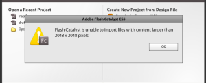
Strategies: So far what has taken me the most (couple days of trying and giving up) is reducing the original illustrator poster size. My original file was too big (20MB) for Adobe Catalyst to open, the error message shown below would keep popping up.
After many attempts what worked for me was, while the poster project was open in illustrator, I selected the entire poster with the Selection Tool, then selected the Free Transform Tool and clicked and dragged one of the posters corner points while holding down the Shift button and shrunk down the image until it look tiny. I then saved it and tried opening in in Adobe Catalyst. It worked!
Once in here I had to readjust and rearrange every single image clipping to make it look like my original poster again and created a duplicate state (State 2) of it. I then created a transparent Rectangle/Elipse over the tent in State 1, selected it, went over to the Interactions tab and Converted Artwork to a Button Component, and finally Added and On Click Interaction that played transition to Application State 2, when in State 1. I then went to state to and created an ellipse, made that a button, which on click switches back to state 1.
This was ALL done with the help of my friend Gary!
Critique 02
It is interesting to me how the first part of the semester, prior the first critique, I found my peers much more helpful than the internet or YouTube to be specific and was able to figure some stuff on my own. Fifty percent of my learning resources prior critique #1 was my peers, forty percent was done on my own and ten percent was via Internet. After the first critique I found almost the opposite to be true, my peers were less useful and the Internet, especially YouTube, more useful, and figured about the same amount of things on my own.
For the audio project I googled some stuff up like: How to import an audio recording into Garage Band, and Volume adjustment on Garage Band. By doing so I figured out that Garage Band was an easy to figure out program, so I went on and started playing with it after uploading my audio file recording. I found many sound clips I liked in Garage Band so I decided to stick to that program for the entire project.
My peers weren’t so much help because most of them were using different programs (PC programs) that my computer didn’t have. Gary tried helping me out with volume adjustment on garage band at one point, but we couldn’t figure it out, so I went straight to YouTube, which had several helpful videos on the topic. I did most of the audio project process on my own and spent most of my time doing actual work instead of researching how to work with a software.
The poster project I did mostly on my own from skills I had gained from the first visual project. Paul helped me out by teaching how to make all my image clippings grayscale, so that the poster could be one even color. He suggested for me to do it in Photoshop in vey simple steps and then open them in illustrator. I didn’t use YouTube much for this project, mostly because I was set on creating a poster out of a bunch of different clipping from different images. Towards the end of the project I decided I wanted to cut/split a picture (the mountain backgrounds), and after several searches, questions to my classmates, and attempts failed to figure it out. I was fine without it but could have had fun with the image if I was able to split the image. It is interesting on how I used my 3 major resources, the Internet, my peers, and me evenly thorough the course so far.
Interactive Map Draft 1
Theme: I am thinking about creating a interactive postcard. I will be pretending to to be a circus women in the the early 1900’s, sending a good friend/relative the interactive postcard. A postcard that gives him/her and idea of what my life as a circus women is; what I see on a daily basis.
I am planning to work off of my poster project. I will expand on by creating interactive parts for what goes on inside the circus tent during a show, what goes on behind the tent (all the circus animals, actors, etc.), and what goes on in front of the tent while the people purchase their tickets and enter the tent.
Final Poster Project
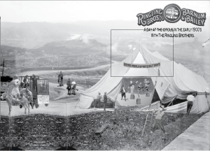
Theme: I ended up sticking with my last mentioned idea, a circus plot/collage poster. I was hoping to recreate a circus day in the early 1900’s, the way it would look if you were looking at it from up above as a spectator. I made the poster a grayscale poster to have an even toned poster, because some images were grayscale and others were colored.
Descriptions: I started off with the banner found at the top of the circus tent. I had initially intended to make it the posters banner up top, but didn’t like how it looked. I created the simple design with the arch tool in photoshop then used the pen tool to trace its paths and gave it a background color. I then choose the circus looking font — Roosewood Std, which was already installed in my computer, and warped it to flow with the banners bottom arch. I saved that as a png file and opened it in illustrator. Once it was in illustrator I used the rectangle tool with a gradient as a color and and applied it vertically as the background.
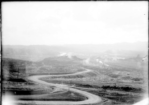
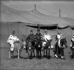
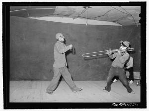
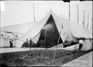
I then focused on cropping up my most complicated images in photoshop with the pen tool and saved them as individual png files per traced character, and inserted the images into my illustrator file as I did each one. I ended up creating this poster from a mixture of 6 different images from the American Memory website.
I ended up having trouble with some of the traced png files towards the end, because once I saved them through Photoshop and transferred them to my illustrator poster file, the trimmed images started coming along with a white squared background. After having this same trouble with about 3 pictures I decided to call it a day.
Final Composition:
Theme: I am now thinking of creating a circus plot/collage poster. I will include a circus tent and many circus characters. I hope to recreate a circus day in the early 1900’s, the way it would look if you were looking at it from up above. If that doesn’t seem to work, I will make a collague with lots of trimmed up circus themed images. Whatever the theme of my project ends up being, the over all poster will most likely be black and white since some images are already black and white and others are colored, to have an even toned poster.
Descriptions:I started off with the banner found at the top of the poster. I created the simple design with the arch tool in photoshop then used the pen tool to trace its paths and gave it a background color. I then choose the circus looking font — Roosewood Std, which was already installed in my computer, and warped it to flow with the banners bottom arch. I saved that as a png file and opened it in illustrator. Once it was in illustrator I used the rectangle tool with a gradient as a color and and applied it vertically as the background. I then focused on cropping up my most complicated images in photoshop with the pen tool and saved them as individual png files per traced character, and inserted the images into my illustrator file as I did each one. I ended up having trouble with some of the traced png files towards the end, because once I saved them though phototshop and transferred them to my illustrator poster file, the trimmed images started coming along with a white squared background. After having this same trouble with about 3 pictures I decided to call it a day.
Below are a few of the pictures I have already trimmed up and saved as png files and what I have as part of my poster so far.
Poster Project Draft 1
Theme Concept:
I am thinking of creating a collage-like poster, on the circus life of the early 1900’s. I will create five focal points along the center of the page, the main focal point in the middle of the page and two descending focal points to the left and right of the main center focal point. Around the five images (focal points) I will try to create a collage of different images from the early circus era.
I then plan to make it a grayscale/news paper look like image, so that all the images are the same color.
Following are 2 different sketched I came up with:
Process Description:
I plan to do a lot of cropping on the original images I got off of the American Memory Project website. So my next step is to learn how to crop up images (which I have never done on any Adobe program), and start cropping. I will then begin playing around with colors and resolution, and start placing and moving pictures around, to see what works and what doesn’t.
This is what I can think of so far that works for me on illustrator:
